
Adding Prev/Next Arrows and Pagers to your banner.
The CMS has support for prev/next buttons and pager buttons, but some older templates or websites do not support them.
You can add the style rules found in the newer templates to get the effect. Instructions are below on how to add the styles to your own template using the CSS area.
Note: you have the ability to break the styling of your template by altering the CSS if applied incorrectly. Apply at your own risk.

Image above: Banner with bule prev/next and pager buttons at bottom.
Step 1. Copy paste the following code into your CSS stylesheet.
Copy / paste the code in the blue box below into your stylesheet area.
You can get to your stylesheet file via the DESIGN button, then from the drop-down menu that appears, choose CUSTOM CSS STYLE SHEETS.
Once in the css stylesheets area, click the EDIT button in the GLOBAL STYLE SHEET (/style.css) to open your stylesheet.
There will already be code in the global stylesheet. Paste in the css below at the top of your CSS file taking care not to override the existing styles.
/***********************************

CYCLE2 PREV / NEXT / PAGER

************************************/

#cmsAltBanner{
background-color:[WSCOL_BANNER];
}
#cmsBannerSlideDiv {
position:relative;
}

#cmsBannerSlideDiv .cycle-prev {
left:0;
}

#cmsBannerSlideDiv:hover .cycle-prev {
left:2%;
opacity:0.6;
}

#cmsBannerSlideDiv .cycle-next {
right:0;
}

#cmsBannerSlideDiv:hover .cycle-next {
right:2%;
opacity:0.6;
}

.cycle-prev,.cycle-next {
opacity:0.1;
height:50px;
width:50px;
font-size:40px;
line-height:50px;
color:#FFF;
border-radius:50%;
background-color:[WSCOL_THEME_PRIMARY];
background-color:[WSCOL_LINK];
cursor:pointer;
position:absolute;
top:50%;
margin-top:-25px;
z-index:99999;
left:2%;
text-align:center;
-webkit-transition:all 300ms ease-in-out;
-moz-transition:all 300ms ease-in-out;
-o-transition:all 300ms ease-in-out;
-ms-transition:all 300ms ease-in-out;
transition:all 300ms ease-in-out;
display:table;
}

.cycle-next {
left:inherit;
right:2%;
}
.cycle-prev:before,.cycle-next:before {
content: "\003C";
}
.cycle-next:before {
content: "\003E";
}

.cycle-prev:hover,.cycle-next:hover {
background-color:[WSCOL_ALINK];
}
#cmsBannerSlideDiv .cycle-pager{
display:block;
}

.cycle-pager {
font-size:24px;
line-height:20px;
position:absolute;
bottom:10px;
z-index:1000;
text-align:center;
width:100%;
}

.cycle-pager span {
cursor:pointer;
}

.cycle-pager span.cycle-pager-active {
color:[WSCOL_THEME_PRIMARY];
color:[WSCOL_LINK];
}

@media only screen and (max-width : 650px) {
#cmsBannerSlideDiv .cycle-pager,.cycle-prev,.cycle-next{display:none;}
}

/* END CYCLE2 PREV NEXT PAGER CODE*/
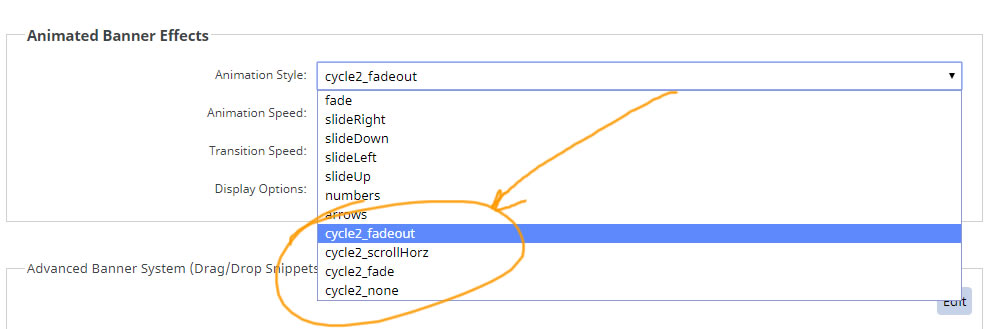
Step 2. Change your slider to one of the CYCLE options available.
In the DESIGN > BANNER area of the cms - change the Animation style to one of the cycle2_ options
Final Steps
Preview your changes, then press PUBLISH to make the changes live on your website.